
R is an amazing programming language for statistical analysis. With the extension of the ggplot2 package it is relative easy to generate meaningful plots. These plots are great for visualizing and describing the data. However, ggplot2 is limited in providing annotations for significance. While obvious differences do not necessarily need significance to prove their distinction, there are many cases where such annotations would be beneficial.
Significance can show statistical differences, even though they seem to be small and irrelevant. Though this does indicate that the difference is meaningful, it can be a pointer to an interesting find. Though calculating the significance is a separate topic of itself, showing the significance in the plots makes it easier to use in presentations, papers, and other publications. The package ggsignif allows us to add significance annotations to ggplot2 figures. An example using the classic “auto mpg” dataset is given shown below.
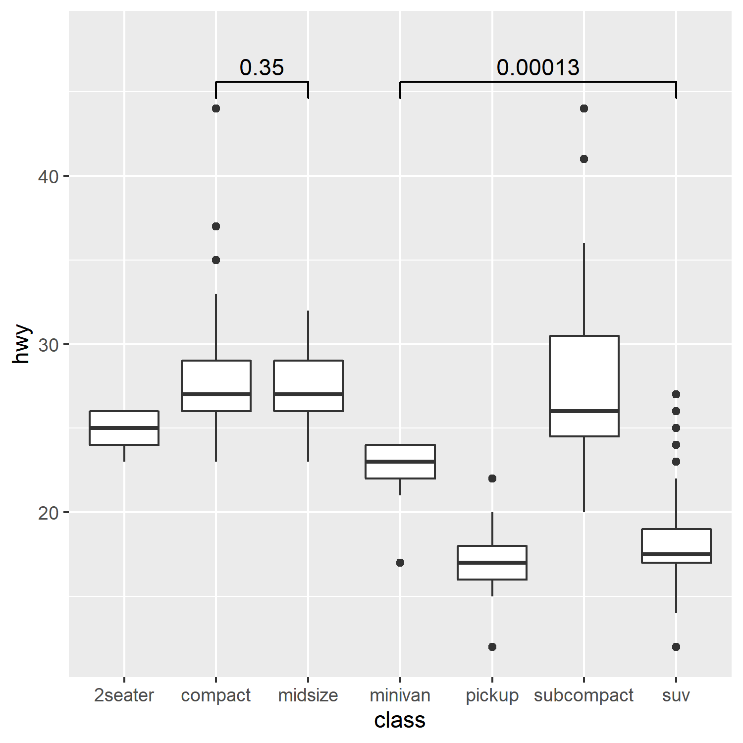
Within the code, we add the significance annotation with geom_signif(). We specify the combinations of categories that we want to compare for significance by providing a list of vectors. Each vector is a pair of strings, with the strings being the labels/factors used to generate the plot. Note that only the first two strings are used if more than two strings are given. The list is given as argument to the parameter comparisons. This will show the numeric significance above brackets, with the brackets indicating the comparisons.
1
2
3
4
5
6
7
library(ggplot2)
library(ggsignif)

p1 <- ggplot(mpg, aes(class, hwy)) +
      geom_boxplot() +
      ylim(NA, 48) +
      geom_signif(comparisons=list(c("compact", "midsize"), c("minivan", "suv")))
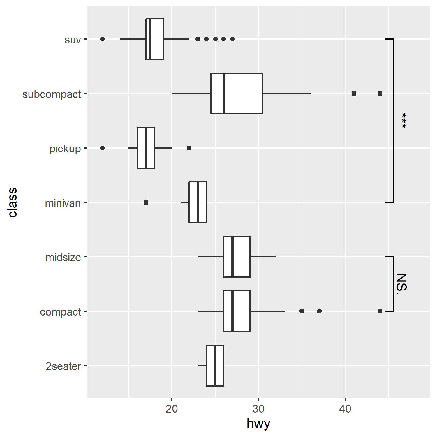
Of course, there are more options to play with. A simple change is the use of symbols instead of numeric values. This can be easily achieved using the map_signif_level parameter within geom_signif(). Setting the parameter to TRUE gives the default mapping, “***” for 0.001, “**” for 0.01, and “*” for 0.05. Any higher values are determined to non-significant (NS.) by the default mapping. You can also give your own mapping in the form of a list.
Another simple change is turning the plot on its side. This is normally done with coord_flip() from the ggplot2 package. Luckily this works out of the box with ggsignif, thus it is incredibly easy to do make this change. The resulting plot can be seen below.
1
2
3
4
5
6
7
8
9
library(ggplot2)
library(ggsignif)

p2 <- ggplot(mpg, aes(class, hwy)) +
      geom_boxplot() +
      ylim(NA, 48) +
      geom_signif(comparisons=list(c("compact", "midsize"), c("minivan", "suv")),
                  map_signif_level=T) +
      coord_flip()
There are even more options available to customize the significance annotations with ggsignif. For those that are interested I recommend reading the documentation. With the basics covered here we can at least start improving our plots with significance.